Frontend
Animation Keywords
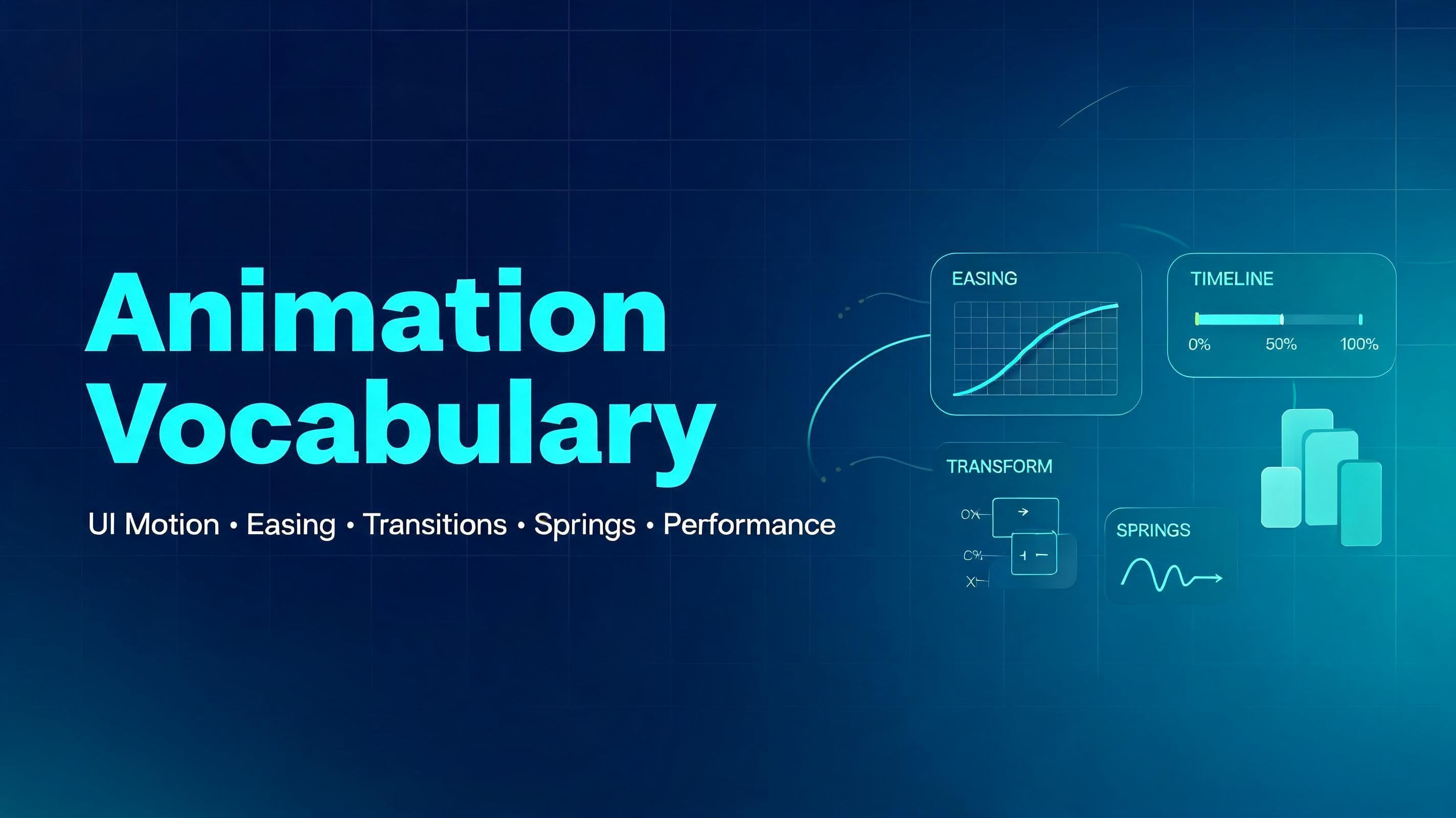
Animation Keys is a collection of essential UI animation terms that explain how motion can guide attention, provide feedback, show relationships between states, and improve the overall user experience in digital products.
A
Written byasta-nguyen
11 Jun 20262 min read1010 views
#Animation Keywords
A curated animation vocabulary cheat sheet for designers and frontend developers. Reference: animations.dev — Animation Vocabulary
#Overview
This document summarizes core animation terms commonly used in UI, interaction design, and frontend implementation. It is adapted from the source page and expanded with a few practical notes, usage hints, and implementation-oriented ideas for learning and teaching.
#Entrances & Exits
How elements appear and disappear.
•
Fade in / Fade out — An element appears or disappears by changing opacity.
•
Slide in — An element enters by sliding in from off-screen, such as from the left, right, top, or bottom.
•
Scale in — An element grows from smaller to full size as it appears, often paired with opacity.
•
Pop in — An element appears with a slight overshoot, creating a playful bounce-like feel.
•
Reveal — Content is uncovered gradually, often using clip-path, masks, or overflow-based animation.
•
Enter / Exit — The animation an element plays when it is mounted or removed from the screen.
#Practical notes
•
Use short and subtle entrance animations for frequently repeated UI, such as dropdowns or tooltips.
•
Avoid dramatic exit animations for actions users perform often, because they can slow the interface down.
•
Good default properties for entry/exit are usually opacity and transform.
#Sequencing & Timing
Coordinating multiple elements or moments.
•
Keyframes — Defined points in an animation timeline, such as 0%, 50%, and 100%.
•
Interpolation / Tween — The generation of in-between frames between a start and end value.
•
Stagger — Several items animate one after another with a small delay between them.
•
Orchestration — Coordinating multiple animations so they feel like one intentional sequence.
•
Delay — The amount of time before an animation starts.
•
Duration — How long the animation runs.
•
Fill mode — Whether an element keeps its initial or final animated styles before or after the animation completes.
•
Stepped animation — Motion divided into discrete steps instead of continuous interpolation.
#Practical notes
•
Stagger is useful for lists, cards, menus, and onboarding sequences.
•
Too much delay makes interfaces feel sluggish; timing should support hierarchy, not decoration.
•
When teaching beginners, sequencing is often easier to explain through list animations than abstract theory.
#Movement & Transforms
Changing an element’s position, size, or angle.
•
Translate — Moves an element along the X or Y axis.
•
Scale — Makes an element larger or smaller.
•
Rotate — Spins an element around a point.
•
Skew — Slants an element along an axis, distorting its rectangular shape.
•
3D tilt / Flip — Rotates in 3D space using transforms like rotateX or rotateY.
•
Perspective — Controls how strong the 3D depth effect appears.
•
Transform origin — Defines the anchor point a scale or rotation animates from.
•
Origin-aware animation — Motion that appears to emerge from its trigger point, such as a popover growing from the button that opened it.
#Practical notes
•
Prefer transform over animating layout properties like top, left, width, or height when possible.
•
Small changes in transform origin can make the same animation feel much more natural.
•
3D transforms are powerful, but easy to overuse in product UI.
#Transitions Between States
Connecting one state, view, or element to another.
•
Crossfade — One element fades out while another fades in, usually in the same visual space.
•
Continuity transition — A transition that preserves orientation by visually connecting before and after states.
•
Morph — One shape smoothly transforms into another.
•
Shared element transition — An element moves and transforms from one location or view into another, preserving identity.
•
Layout animation — Size and position changes animate smoothly instead of snapping instantly.
•
Accordion / Collapse — A section expands or collapses to reveal or hide content.
•
Direction-aware transition — Forward and backward navigation animate in opposite directions to reinforce spatial logic.
#Practical notes
•
Shared element transitions are excellent for cards, galleries, media previews, and route transitions.
•
Layout animation makes interfaces feel more polished when content changes dynamically.
•
Direction-aware transitions are especially useful in step-based flows and mobile navigation.
#Scroll
Motion tied to scrolling or navigating between views.
•
Scroll reveal — Elements fade, slide, or transform into place as they enter the viewport.
•
Scroll-driven animation — Animation progress is tied directly to scroll position.
•
Parallax — Background and foreground layers move at different speeds to create depth.
•
Page transition — Animation played when navigating from one page or route to another.
•
View transition — The browser or framework morphs between states or pages while preserving shared visual continuity.
#Practical notes
•
Scroll reveal should support reading flow, not compete with content.
•
Heavy parallax can feel gimmicky and can hurt performance on weaker devices.
•
For practical UI work, route transitions and scroll reveals are usually more valuable than complex scroll art.
#Feedback & Interaction
Responding to the user’s actions.
•
Hover effect — A visual change when the cursor moves over an element.
•
Press / Tap feedback — A subtle scale or shadow change when an element is pressed.
•
Hold to confirm — A progress-driven interaction requiring a press-and-hold gesture.
•
Drag — Moving an element by grabbing it, often with momentum on release.
•
Drag to reorder — Rearranging a list while neighboring items shift to make space.
•
Swipe to dismiss — Dragging an item off-screen to remove or close it.
•
Rubber-banding — Resistance and snap-back when dragging past a limit.
•
Shake / Wiggle — Quick lateral motion indicating invalid input or failure.
•
Ripple — A wave or expanding circle from the interaction point confirming a click or tap.
#Practical notes
•
Feedback should happen quickly, ideally within the same interaction frame.
•
Press and hover states help interfaces feel physical and responsive.
•
Gesture-based motion is easier to understand when the motion direction matches user intent.
#Easing
How speed changes during motion.
•
Easing — The rate at which an animation accelerates or decelerates.
•
Ease-out — Starts fast and ends slowly; often the best default for UI feedback.
•
Ease-in — Starts slowly and ends fast; can feel heavy when overused.
•
Ease-in-out — Starts slow, speeds up, then slows down again.
•
Linear — Constant speed from start to finish.
•
Cubic-bezier — A custom easing curve for fine-grained control.
•
Asymmetric easing — A curve where acceleration and deceleration are intentionally unbalanced.
#Practical notes
•
Ease-out is often the safest default for entrance and interaction animations.
•
Linear works best for loaders, marquees, and other machine-like repeated motion.
•
Custom curves matter most when refining product feel, not when learning fundamentals.
#Spring Animations
Physics-based motion instead of fixed-duration timelines.
•
Spring — Motion driven by parameters such as stiffness, damping, and mass.
•
Stiffness / Tension — How strongly the motion pulls toward its destination.
•
Damping — How quickly the motion settles.
•
Mass — How heavy the animated object feels.
•
Bounce — Overshoot and settle behavior that adds liveliness.
•
Perceptual duration — How long the animation feels finished to the user.
•
Momentum — Motion continuing with carried velocity after a drag or release.
•
Velocity — The speed and direction of movement at a given moment.
•
Interruptible animation — Motion that can be redirected mid-flight without abrupt snapping.
#Practical notes
•
Springs are excellent for drag interactions, toggles, drawers, and interactive layout shifts.
•
A spring can feel more natural than a fixed duration because it responds like a physical system.
•
Beginners should learn the relationship between stiffness and damping before tuning mass.
#Looping & Ambient Motion
Animations that repeat or run continuously.
•
Marquee — Text or content scrolling continuously in a loop.
•
Loop — Any repeating animation, finite or infinite.
•
Alternate (yoyo) — An animation that plays forward, then reverses direction.
•
Orbit — One element circling around another.
•
Pulse — Gentle repeating scale or opacity change for emphasis.
•
Float — Subtle up-and-down drifting motion.
•
Idle animation — Ambient motion while an element waits for interaction.
#Practical notes
•
Ambient motion should be quiet and low-frequency.
•
Repeating animation should not distract from reading or task completion.
•
Use loops carefully in dashboards and productivity tools where constant motion can create fatigue.
#Polish & Effects
Small touches that improve perceived quality.
•
Blur — Softens an element or helps mask motion artifacts.
•
Clip-path — Restricts visible content to a shape for reveals and wipes.
•
Mask — Hides or reveals content using a shape or gradient, often with softer edges than clip-path.
•
Before / after slider — A draggable comparison control between two overlaid states or images.
•
Line drawing — An SVG path appearing as if it is being drawn in real time.
•
Text morph — Text transitions that reshape or animate between states.
•
Skeleton / Shimmer — Placeholder loading UI with animated sheen.
•
Number ticker — Numbers rolling or counting toward a new value.
•
Tabular numbers — Fixed-width digits that prevent shifting during updates.
•
Typewriter — Characters appearing sequentially as if typed.
#Practical notes
•
Skeletons can improve perceived performance when real content takes time to load.
•
Tabular numbers are essential in timers, counters, and analytics UIs.
•
Effects should support clarity; too many layered effects often reduce polish instead of adding it.
#Performance
What keeps motion smooth instead of stuttering.
•
Frame rate (FPS) — Frames rendered per second; 60 FPS is the common smoothness baseline.
•
Jank — Noticeable stutter caused by missed rendering deadlines.
•
Dropped frame — A frame not rendered in time, creating a visible hitch.
•
Compositing — Letting the GPU animate certain visual changes on a separate layer.
•
will-change — A CSS hint that an element is likely to animate soon.
•
Layout thrashing — Repeated layout recalculation caused by costly reads/writes or layout-affecting animation.
#Practical notes
•
In web UI, animating transform and opacity is usually the safest path for smoothness.
•
will-change should be used sparingly, not globally.
•
Performance is part of animation design, not a separate cleanup phase.
#Principles to Know
Concepts that guide when and how to animate.
•
Purposeful animation — Motion should clarify, guide, or respond, not merely decorate.
•
Anticipation — A small preparatory movement before the main action.
•
Follow-through — Secondary elements continue or settle after the primary motion stops.
•
Squash & stretch — Shape deformation that communicates speed, flexibility, or impact.
•
Perceived performance — Animation can make systems feel faster and more understandable.
•
Frequency of use — Frequently repeated animations should be shorter and subtler.
•
Spatial consistency — Motion should preserve an element’s identity across changes.
•
Hardware acceleration — Leveraging GPU-friendly properties for smoother rendering.
•
Reduced motion — Respecting user settings that request less motion.
#Practical notes
•
A useful rule of thumb: the more often an animation appears, the less attention it should demand.
•
Motion should preserve orientation during layout shifts, route changes, and async updates.
•
Accessibility includes motion sensitivity, not just color contrast and keyboard support.
#Additional ideas
These additions are not explicit glossary items from the source page, but they are useful for teaching and day-to-day frontend work.
•
Motion hierarchy — Important UI actions should have stronger visual emphasis than secondary ones.
•
State clarity — Animation should help users distinguish loading, success, error, disabled, and active states.
•
Temporal consistency — Similar interactions should use similar timing so the product feels coherent.
•
Microinteraction — A small interaction detail, such as button feedback or toggle motion, that improves perceived quality.
•
Motion budget — A practical limit on how much motion a screen or feature should contain.
#Teaching suggestions
For interns or junior frontend developers, animation is easiest to learn in this order:
1.
Opacity + transform basics — fade, slide, scale.
1.
Timing and easing — duration, delay, stagger, ease-out.
1.
Interactive feedback — hover, press, accordion, toast, modal.
1.
Layout and shared transitions — reordering, expanding cards, route changes.
1.
Performance and accessibility — reduced motion, jank avoidance, transform-first mindset.
#Reference
•
Source page: https://animations.dev/vocabulary
Filed under
FrontendAnimationAngularNextjsReactVue
A
View all postsAbout the author
asta-nguyen
Sharing ideas and building in public.
Loading comments...
Keep reading
More from asta-nguyen
 Backend
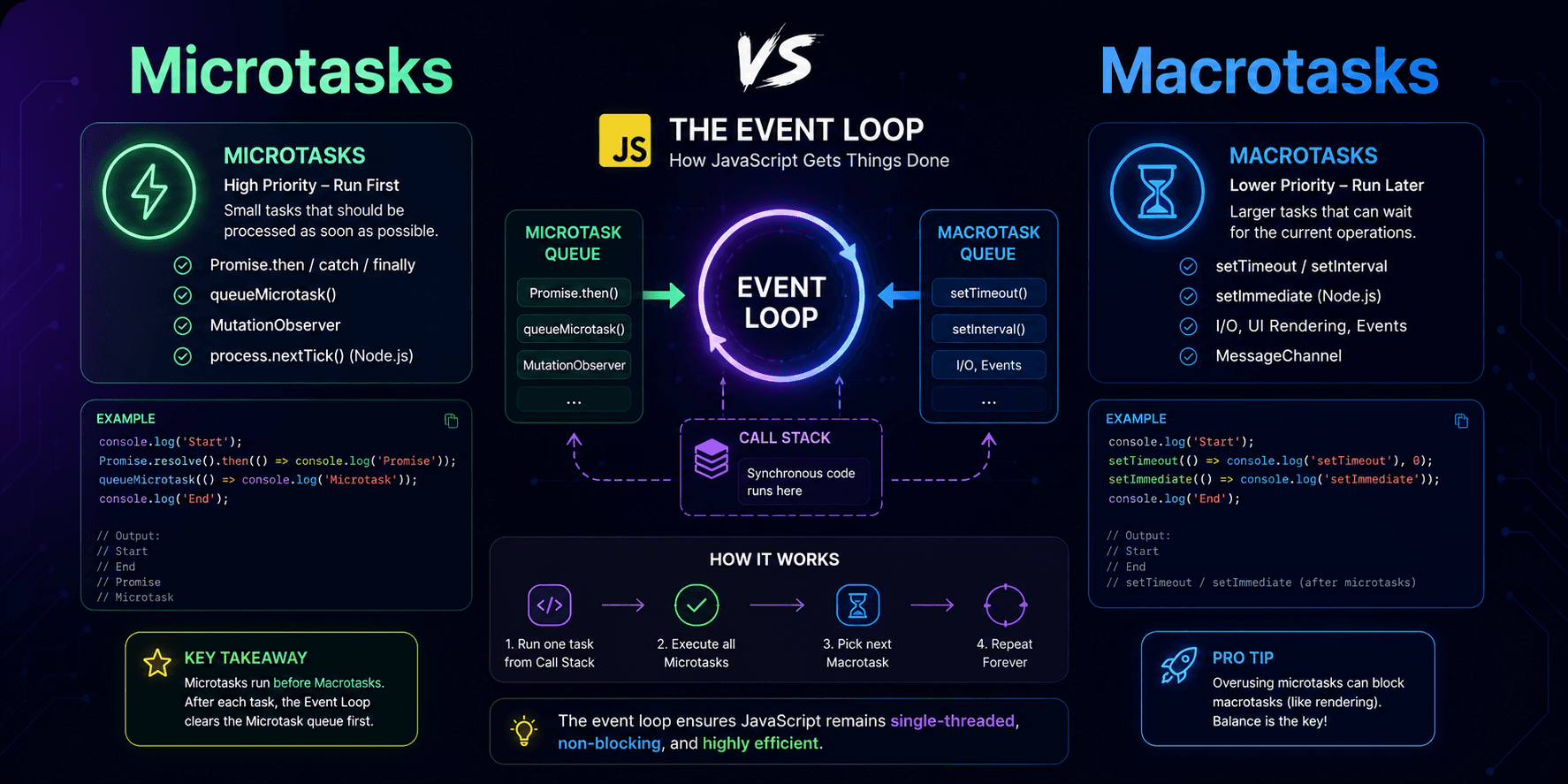
JavaScript Microtasks and Macrotasks: A Practical Guide to the Event Loop
This article explains JavaScript microtasks and macrotasks in practical terms, showing why `Promise.then()` usually runs before `setTimeout(..., 0)` and how the event loop prioritizes different kinds of asynchronous work.
A1 min
 Frontend
When to Use useCallback in React: A Complete Guide with Real Examples
Learn when and why to use React's useCallback hook to optimize your application's performance. This comprehensive guide covers practical use cases, real-world examples, common pitfalls, and best practices to help you make informed decisions about memoizing functions in your React components.
A2 min
 FrontendFeatured
Next.js Link vs Anchor Tag: The Ultimate Guide to Fast Navigation
Discover why the Next.js Link component outperforms traditional anchor tags for internal navigation. Learn the key differences, performance benefits, and practical implementation with real-world code examples to optimize your Next.js application.
A3 min